Manuel Snr – Product Designer

About Regal Flowers

Regal flowers is the most trusted online and walk-in fresh Flower Shop that sells and delivers luxurious fresh flowers and gifts across Lagos and Abuja, Nigeria.

Problem

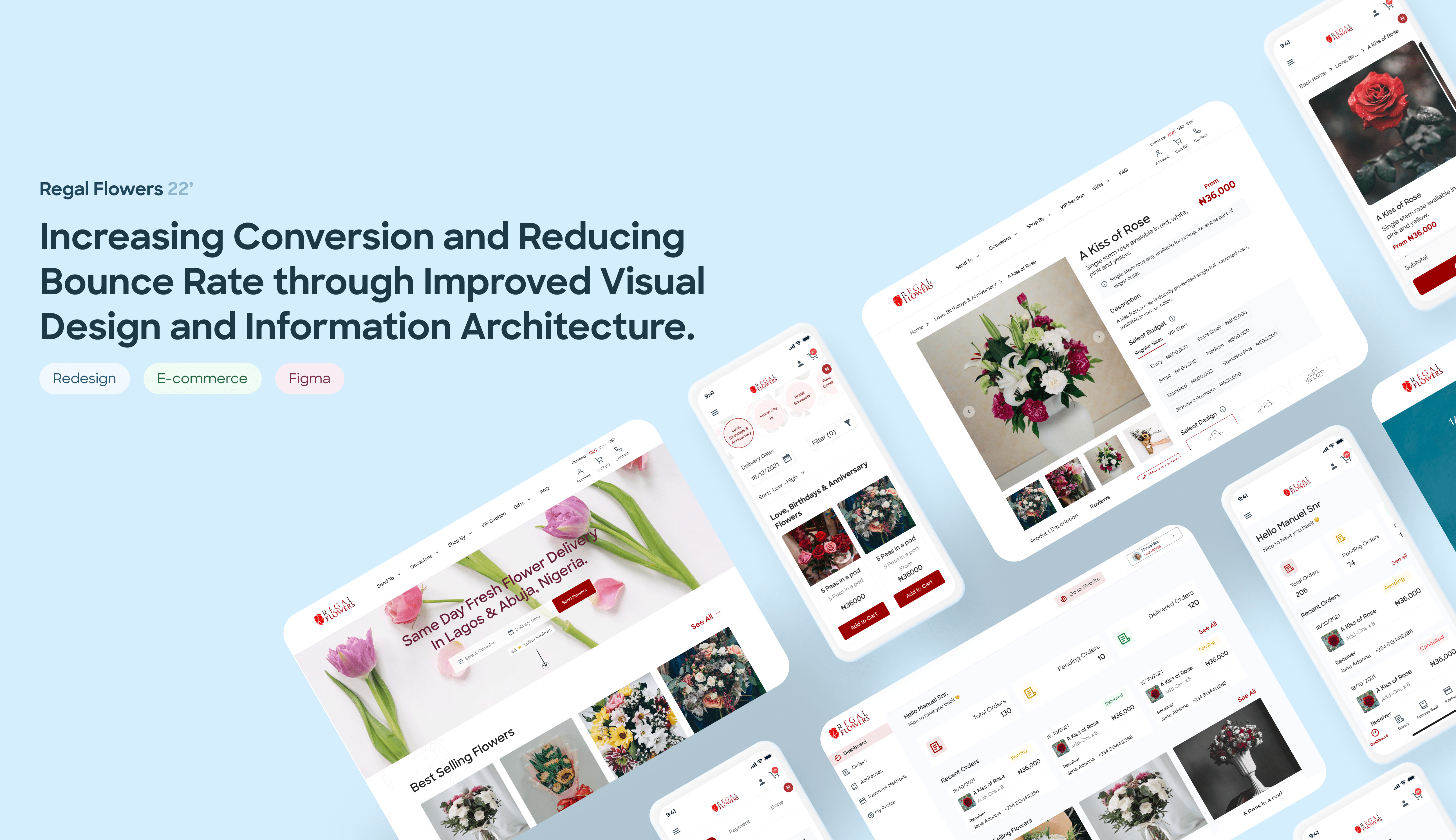
Regal flowers had an inconsistent and quite outdated design, which did not allow the platform to thrive in a densely populated e-commerce niche. The goal was to recreate the product interface to reach new heights.

Solution

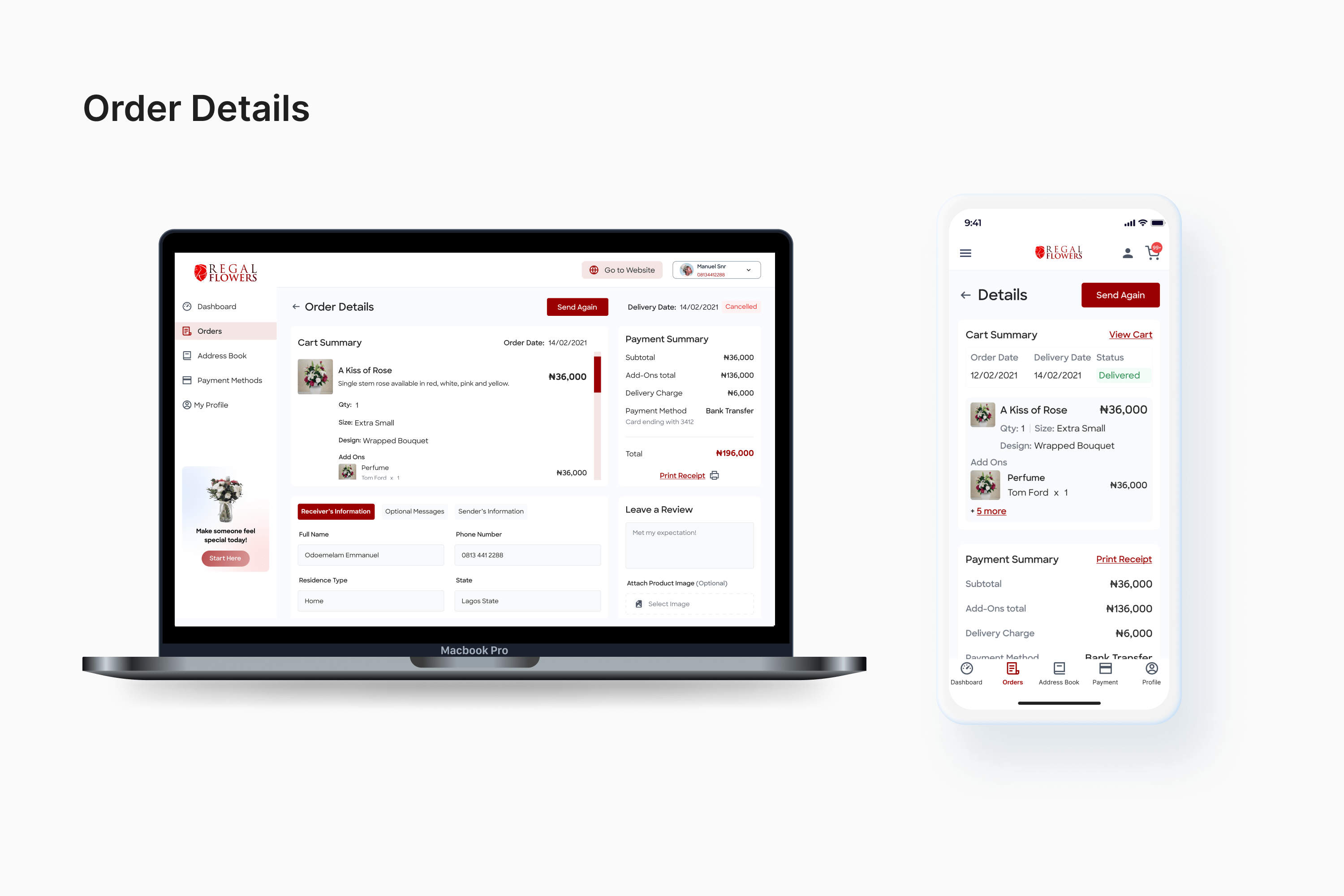
I decluttered the homepage, improved the product page by making the Call to action (CTA) prominent and visible in the first-page viewport, simplified the payment process, and created a personalized web app, to ensure users quickly purchase products and flow effortlessly to checkout, while maintaining brand trust.

Effect

-Improved visual appeal

-Reduced the checkout process by 60%

-Consistent visual language

-Improved information architecture

Research Feedback

To properly understand the task, I started off by conducting research on the goals and values of Regal flowers. In addition to this, a site audit, focusing on usability heuristics was conducted on the existing website to test usability and efficiency leading to redesign opportunities.

Site Audit Feedback
  • User control and freedom: The present website doesn’t give users the flexibility to back out of an action or go back.
  • Consistency and standard: The present website didn’t follow industry convention and lacked information hierarchy.
  •  Flexibility and efficiency of use: The existing website doesn’t cater to both experienced and inexperienced users.

79%

of smartphone users have made a purchase using their mobile devices in the last half of 2020. _Simicart

63%

of mobile users abandon a product or site at least once due to mobile usability issues. _Baymard Institute

17%

of Regal flowers users are returning, which is lower than the 20% benchmark and suggests low customer engagement.

58%

of users abandon a page without taking action. This is a high bounce rate — the site may not give a good first impression.

User Interviews Feedback

Scheduling interview sessions with the company staff and active website users; problems with the current website and data handling issues by the office staff were gathered and documented.

  • Too many things to understand.
  • Inconsistent font sizes.
  • Cluttered webpage
  • Hidden Call to action (CTA)
  • Lack of hierarchy
  • Tedious payment process
  • Difficulty in handling order number
  • Difficult payment confirmation process

After further conversations and surveys, we learned that Regal flower’s audience value:

❤️ Trust

Customers gauge their trust with reviews, testimonials, etc.

📍Good Navigation

Customers expect to easily find and purchase products, otherwise they will abandon the site.

🎨 Aesthetics

Customers feel that they can trust a company if its products and site are attractive and modern.

Solution Breakdown

According to Principle of usability described by Jakob Nielsen that recommends the use of familiar patterns in design, in order to facilitate user experience, because users prefer it when a site works in the same way as all the other sites they already know. The following metrics were achieved:

  • Clear hero text and image to blend.
  • Organised information hierarchy, placing the most important information at the top.
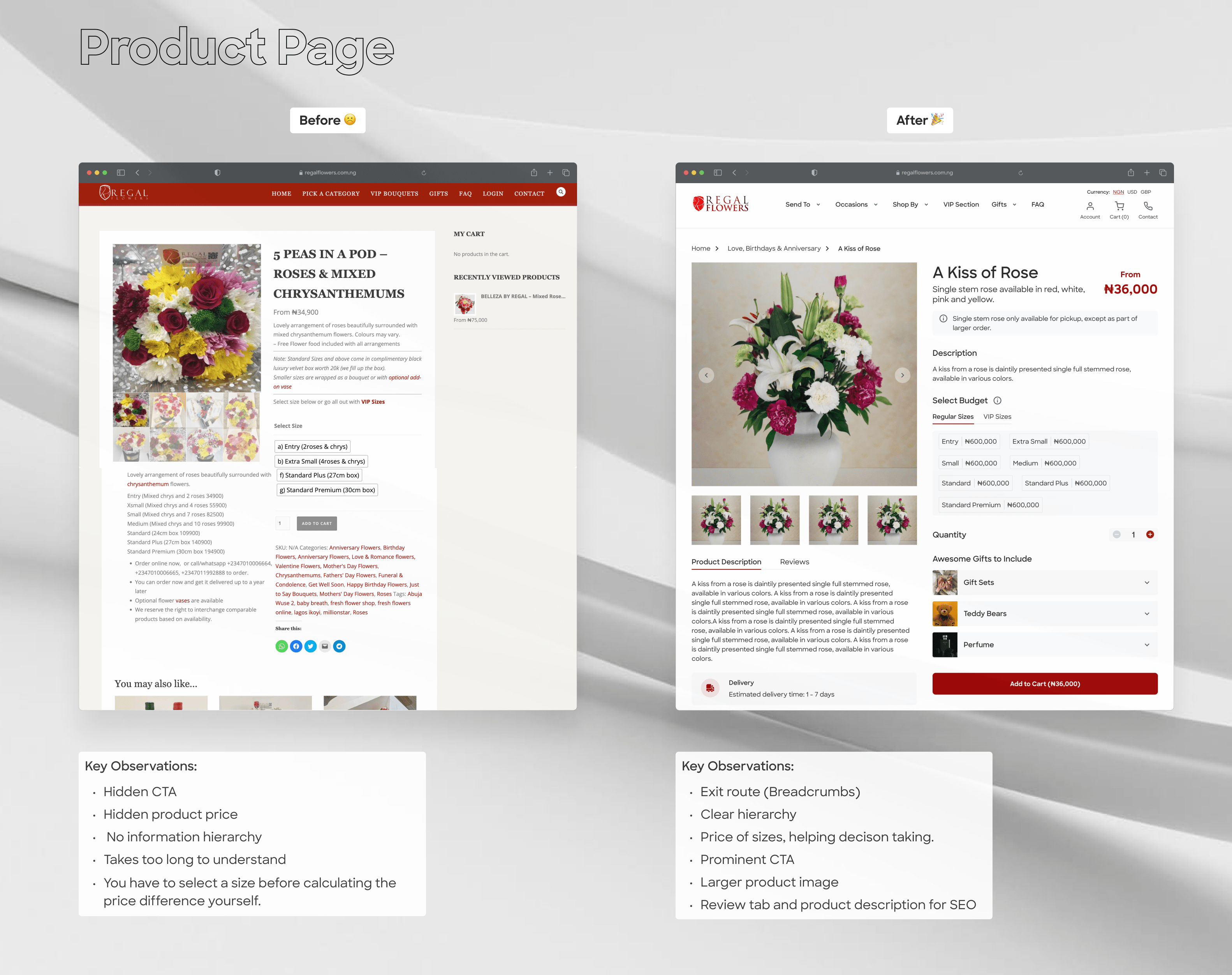
  • Introduction of breadcrumbs, an exit strategy from pages.
  • Simplified product page, with a prominent Call to action (CTA) to increase conversion.
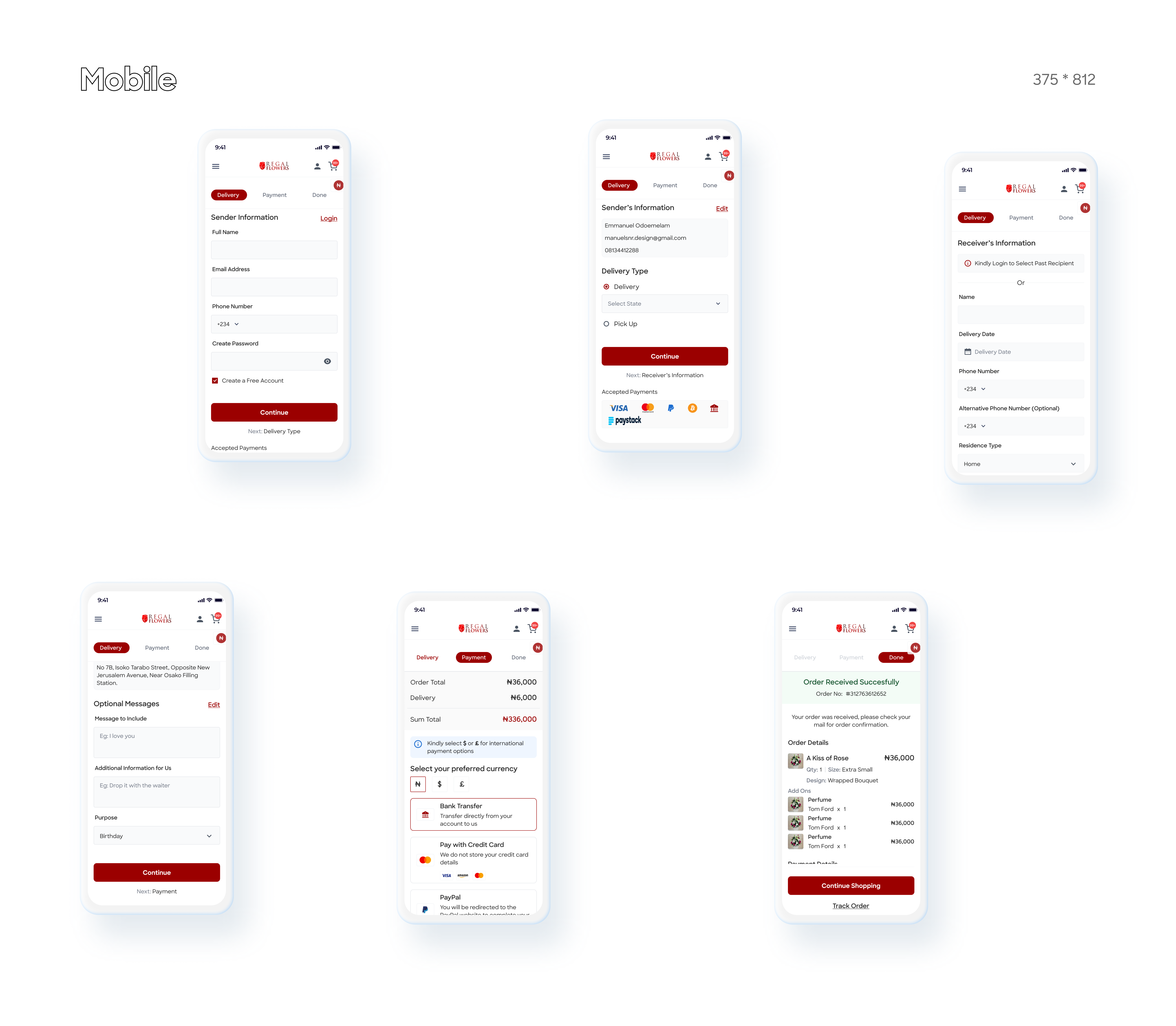
  • Smooth checkout and payment process, highlighting the unique order number of a successful order placement.
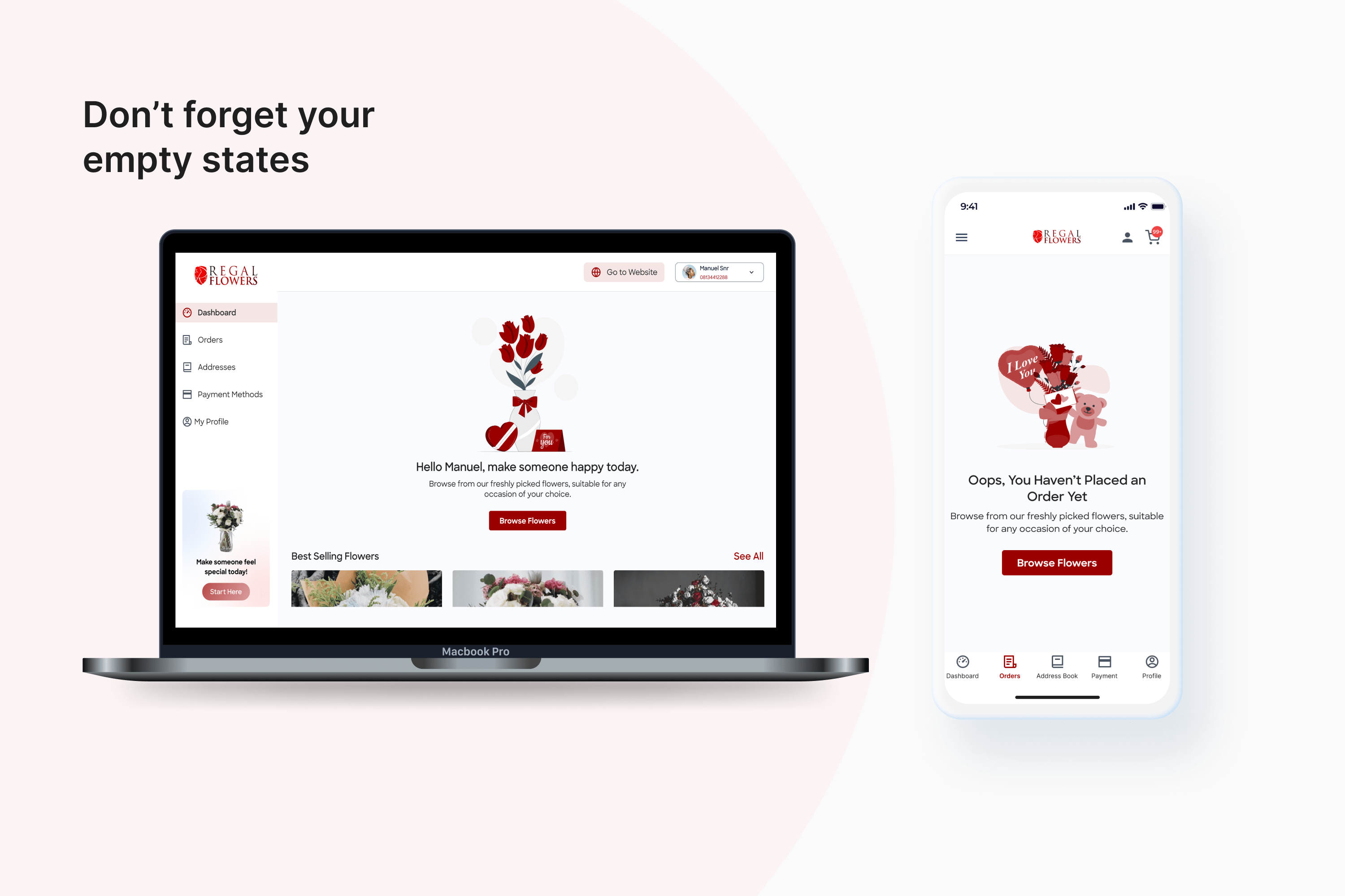
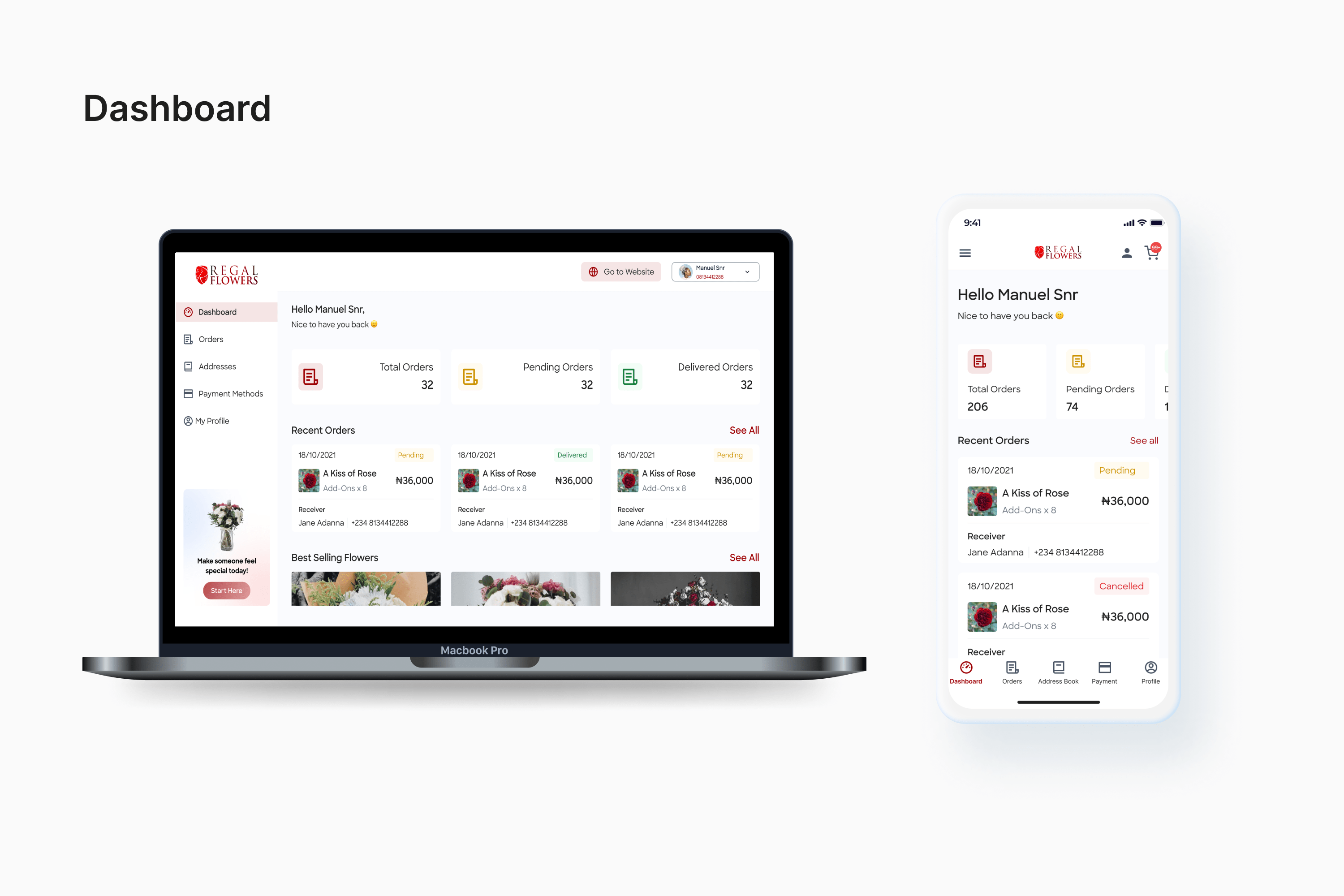
  • Personalised and responsive dashboard.
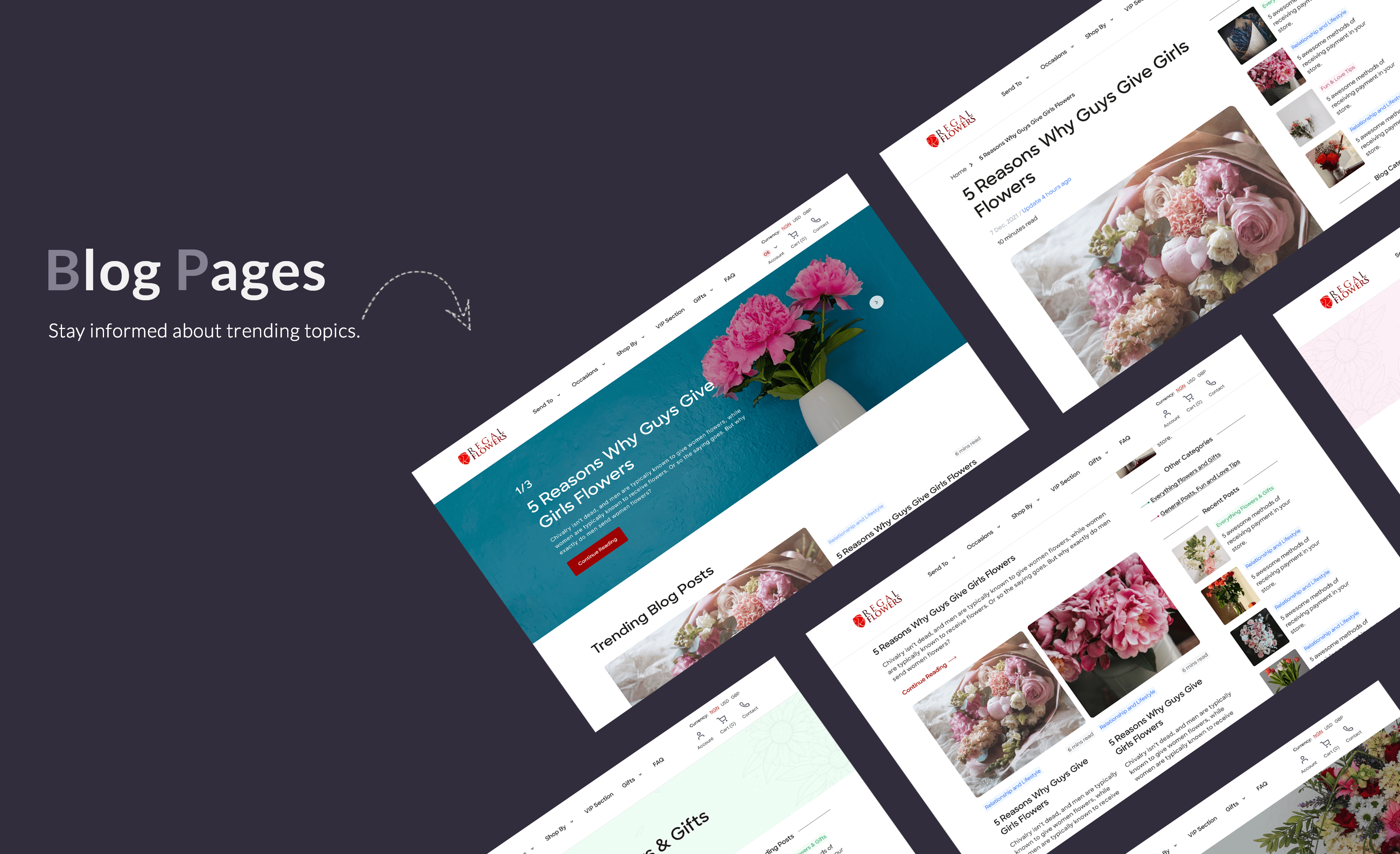
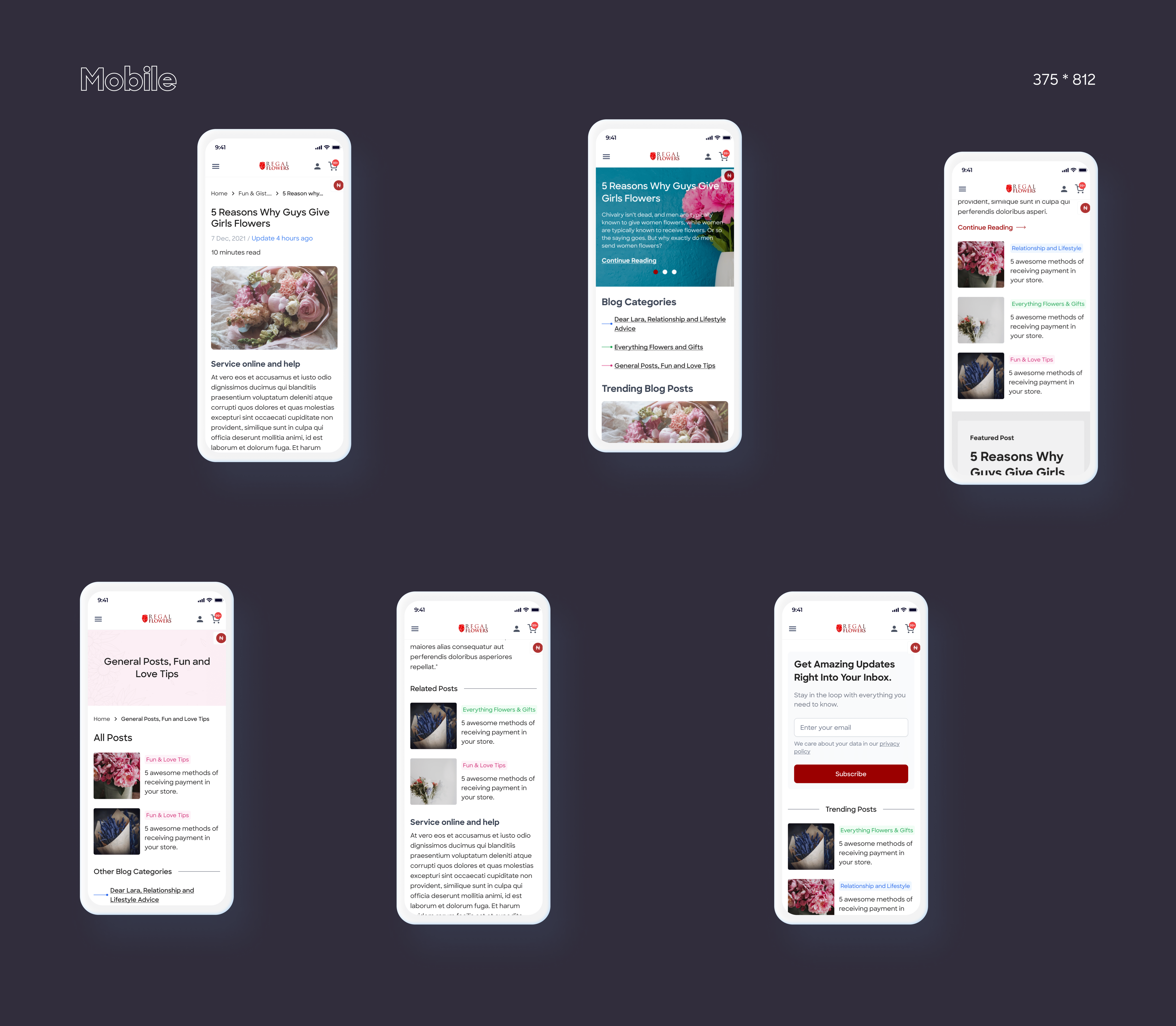
  • Informatory and interactive blog section to boost retention and returns.
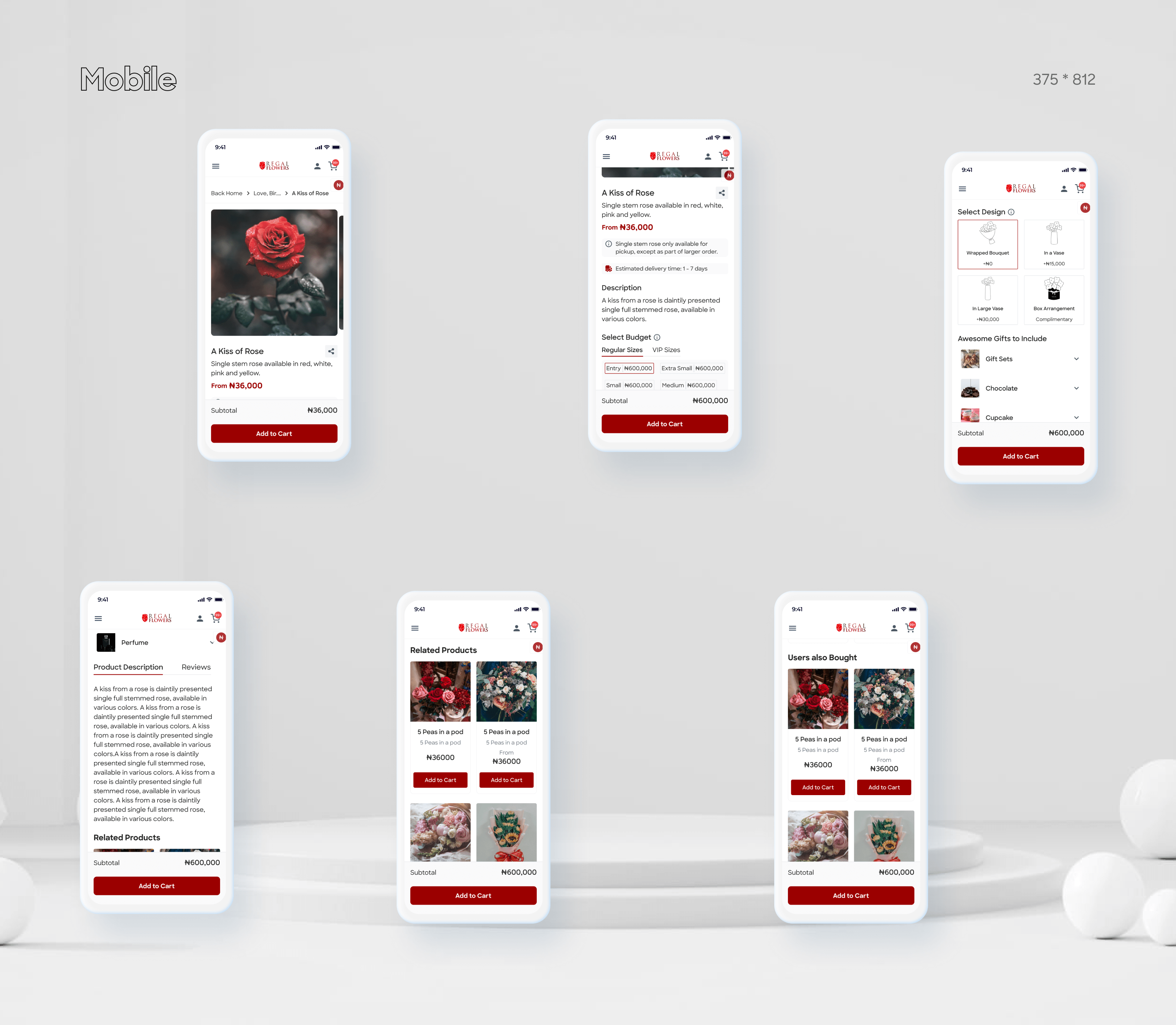
  • Mobile responsive platform.

💡 Key Takeaways

  • When designing for E-commerce, it is important to keep in mind that you want your users to make a decision as quickly as possible; so designs should be intuitive, and checkout fast.
  • Use colour to your advantage by invoking different feelings, emotions, and actions from your users.
  • Scannability and Searchability are the most important things to keep in mind as you want your user to get a grip of your content quickly.
  • Reusing patterns to make the interface fun and easily digestible is an easy way to encourage retention.

Declustering the Homepage

Homepage

A new homepage with added accurate visual accents, captivating users’ attention and guiding them to purchase flowers and gifts for their special occasion.

Frequently Asked Questions

In a dense niche like E-commerce, a key section to increase the SEO ranking of your website is the FAQ section.

There is an ongoing research regarding using accordions for the FAQ section of your website. Sources claim that, it limits the ability for google search engine to crawl for key contents on your website, and that’s bad for business. 

To be on the safer side, I created a unique page just for the FAQ section, grouping similar question to increase page scanning and promote proper information architecture.

Putting into account the height of a standard laptop/desktop, I designed a table of content that sticks to the left hand side while scrolling, this makes it easy for a user to jump right back to a previous section that is no longer in the current viewport.

Category Page

The category page was redesigned to depict clearly the categories of products owned by the company.

Product Page

A very important section of an E-commerce website is the product page. If users find it difficult to decipher the architecture of the product page (hidden CTA, too much information, unappealing product images), this can lead to a high bounce rate and reduced conversion rate, further leading to a loss in revenue and return rate. One of the goals of this redesign was to simplify the product page, placing the key information on top and giving an exit route from the page, while meeting page criteria from the client.

The Checkout

Checkout Prototype

Desktop

Mobile

Blog Pages

Web App Prototype

Next Steps

The product is currently under development. Initial high fidelity testing already proved to exceed the set goals. I can’t wait to see the effect of this redesign on the overall metrics and user feedback. 🎉

View Other Works