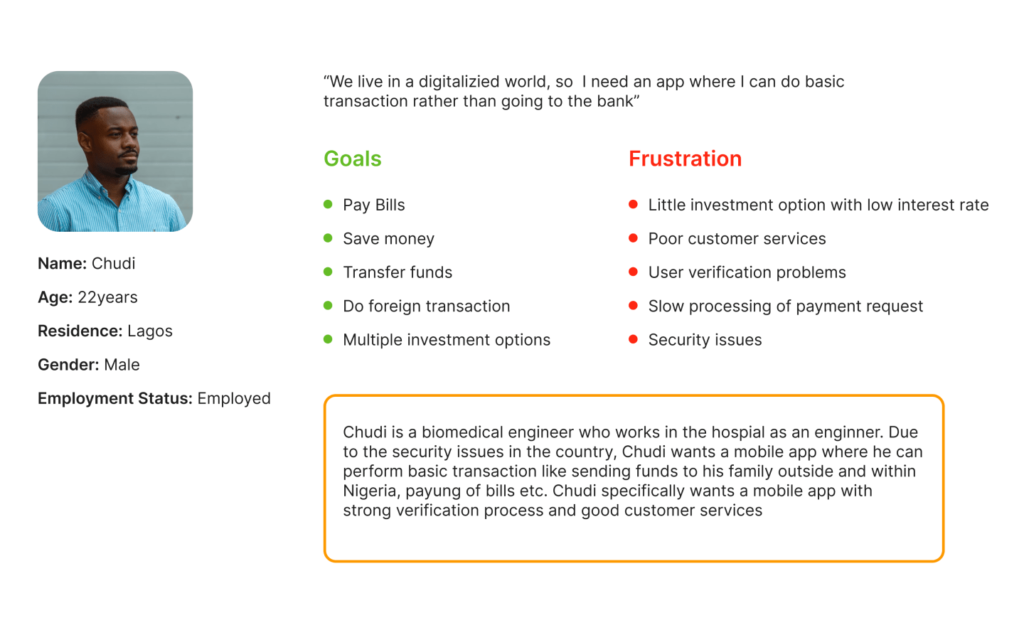
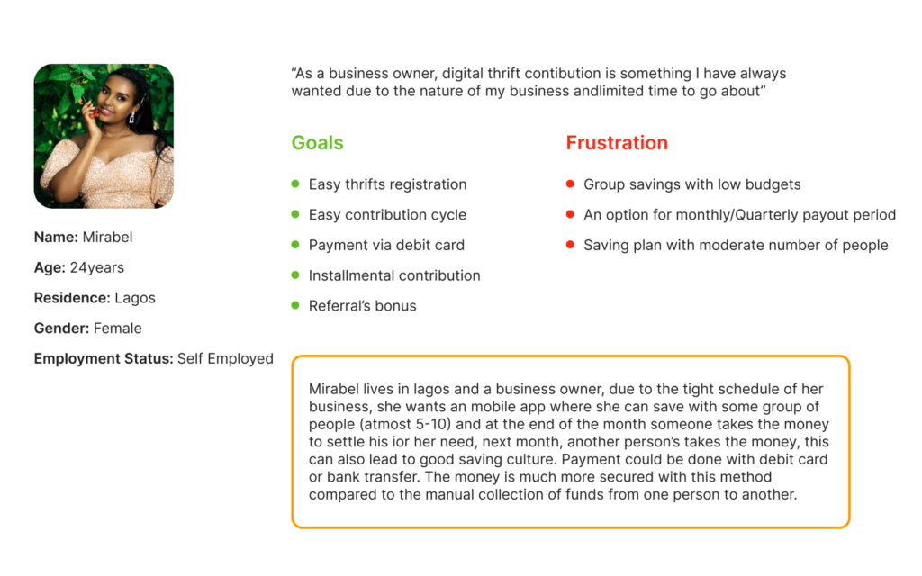
To validate project direction and understand user needs better, survey forms were sent out to targeted social media platforms and demographics. We received over 30 responses from the survey.


Flashing through? No worries, I’ll cut to the chase 
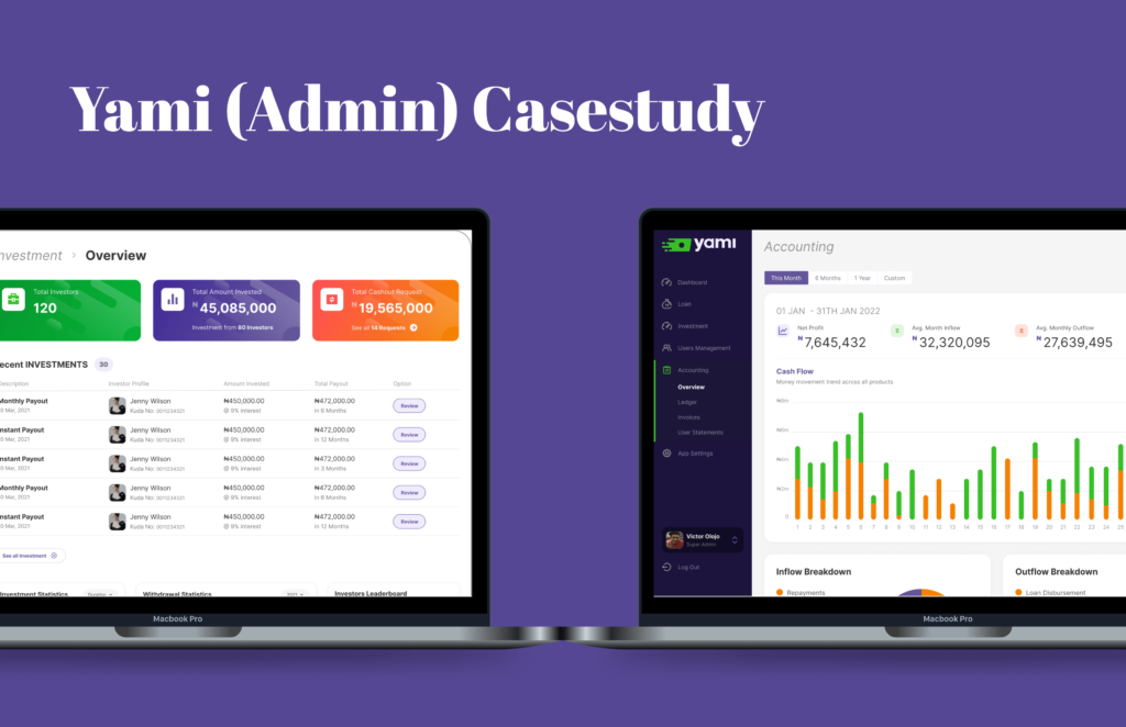
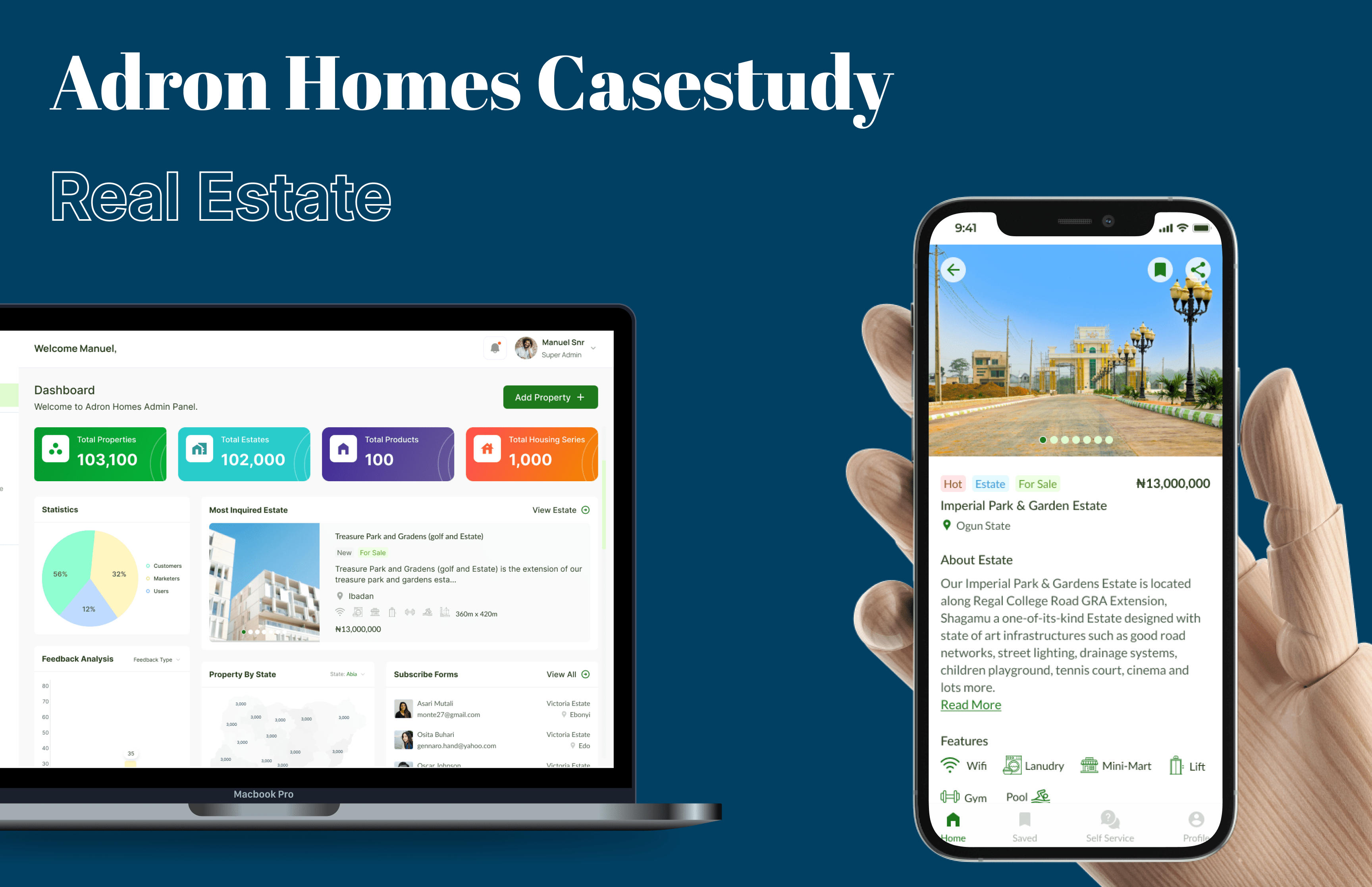
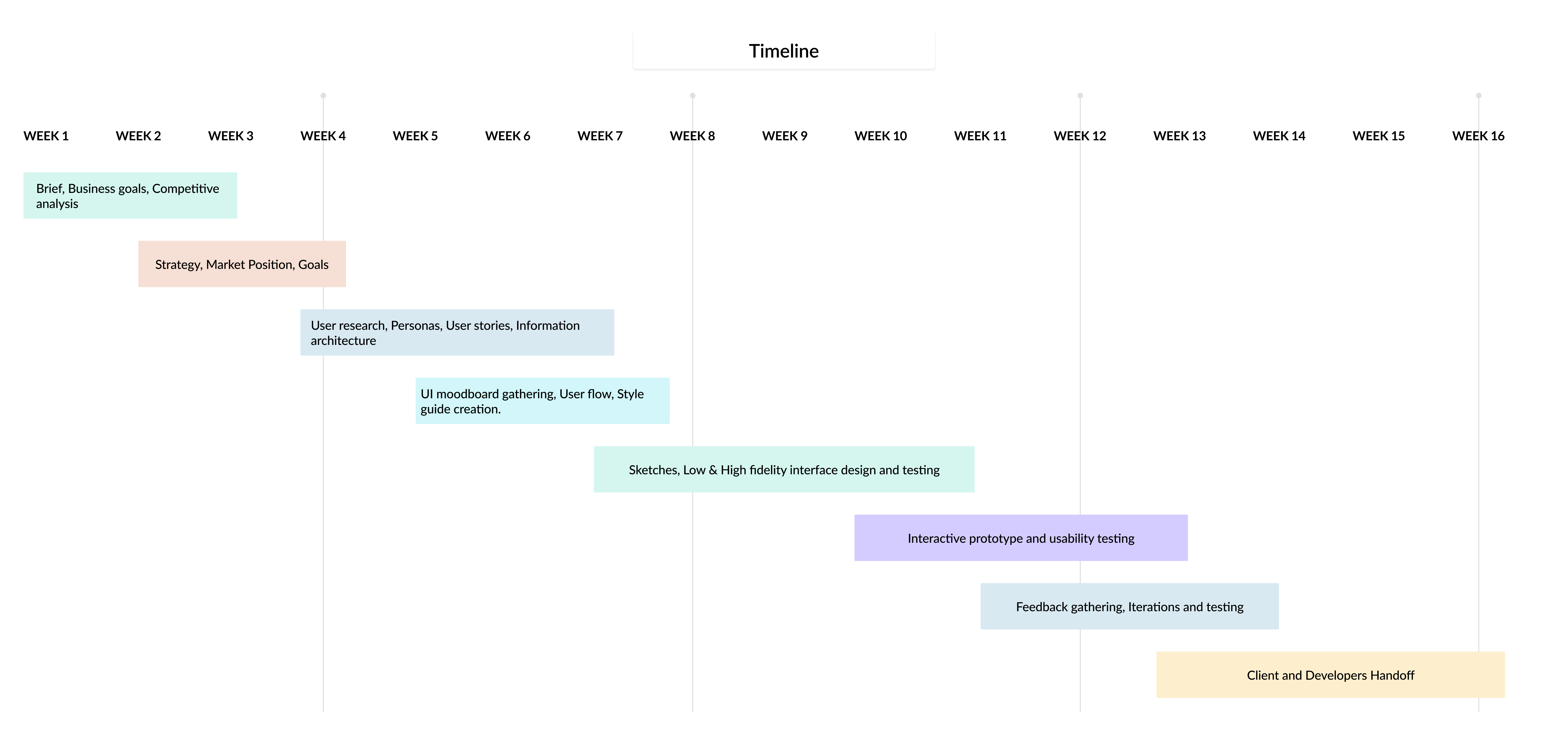
Here’s a summary of the project. 3Ws: Who we’re doing this for, Why we’re doing this and What we did.


- 93.4% of the audience were between the ages of 18 – 30
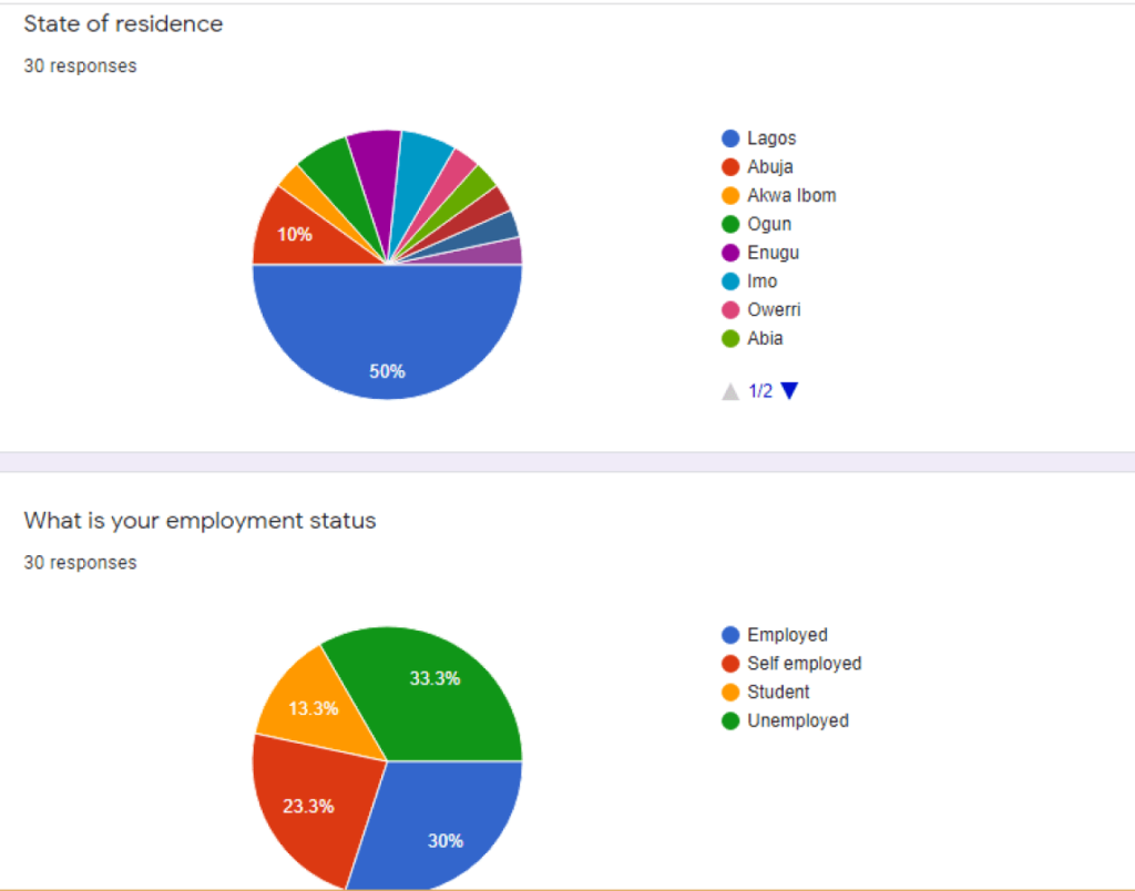
- 62.7% had a higher capacity to save money as they were either employed, self employed or students.
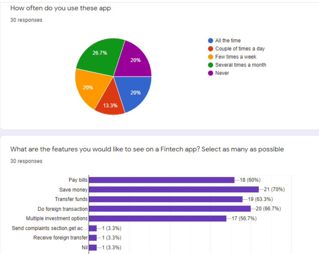
- 73.3% are already familiar with using a fintech platform.
- Product Validation
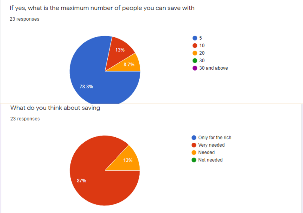
 Over 58% of participants are inclined with the product goal already (Transfer funds, Save money, and pay bills) and 60.9% prefer saving in groups.
 - 78.3% of participants prefer saving in small groups (5 saving members)
- A common problem faced by majority of users is low investment options.
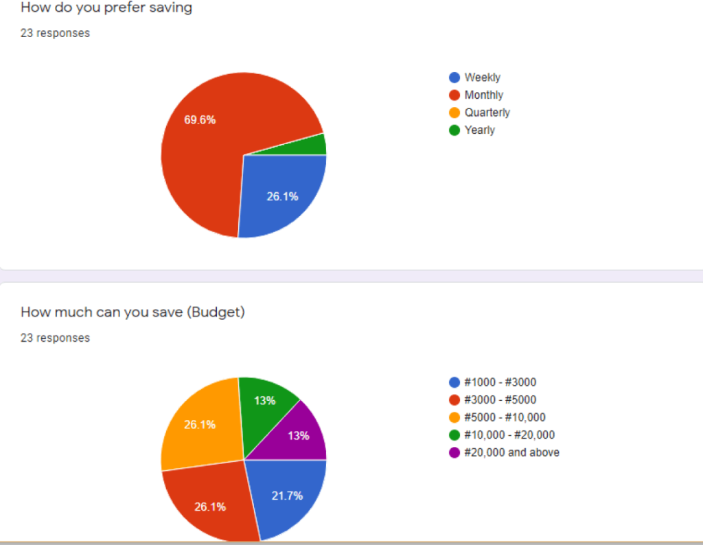
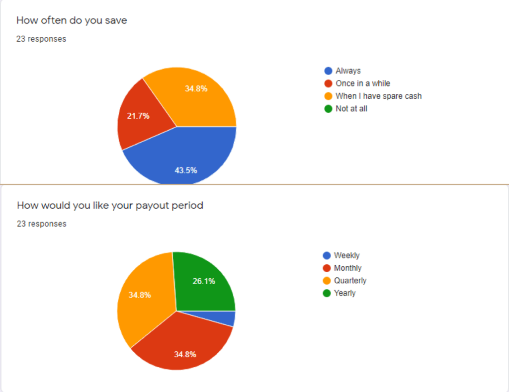
- 69.6% of participants prefer saving monthly.
- The maximum amount majority of participants prefer saving is ₦10,000.

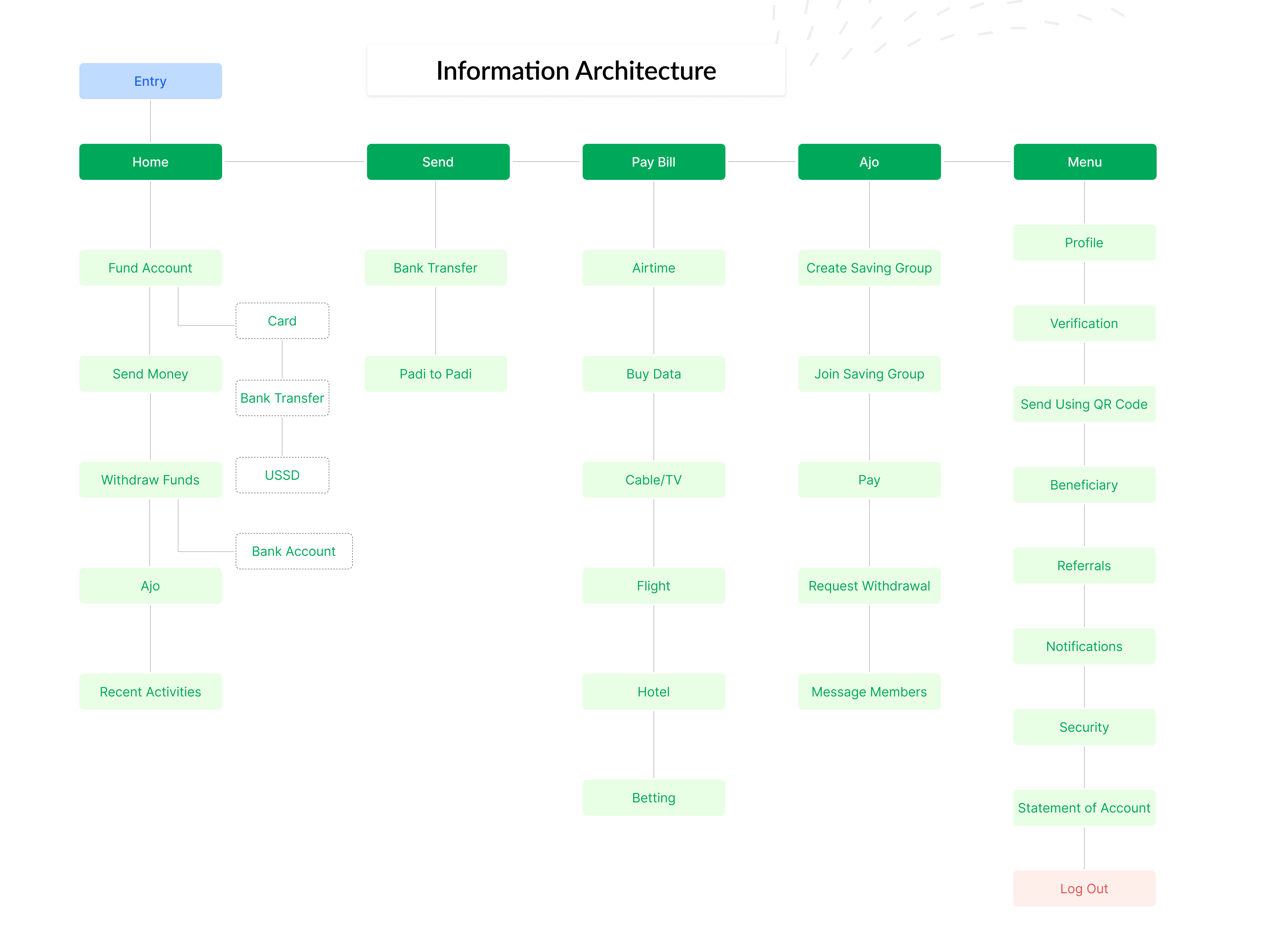


This project is open to massive expansion and growth, the product aims to expand to cover areas like virtual cards procurement, investment lending and crypto currency. Oh yes! I loved the experience